Supporting the agents

Centering customer support team needs
In 2018, Tekton recognized its Tool Support website as a facilitator of industry-leading customer support. However, by 2024, it became clear that it struggled to shoulder evolving user needs.
I was part of an initiative to revamp the platform to better meet the needs of end-users and support agents.
Design by development
A small, developer-only group conceived the Tekton Support Team site, TST, as a go-between for support agents and the company’s ERP. The ERP stored cases from tekton.com users. But, case management there was slow and cumbersome. Meanwhile, the newly created TST back-end could process data and actions faster.
While this suited the team for a time, by early 2024, we recognized that the code and the front end weren’t properly serving the support agents. Data frequently failed to sync, the interface was cumbersome, and agents often switched between the site and other platforms to get the bigger picture they needed to resolve cases.
The inadvertent designs by developers had created an interface that both supported and constrained casework.
Modernization without losing speed
Tekton had deeply ingrained fast, no-nonsense support in its branding and principles. We wanted to continue fostering that work by providing a fresh base for the site—one we could continue building on in the future.
Our high-level goals were to:
Keep casework fast for new and seasoned support agents alike
Create a scalable platform that could accommodate future improvements
I led the site design starting at the end of August 2024. Working alongside a multidisciplinary team of developers, product managers, and support agents, I focused on crafting a unified user experience, simplifying workflows, and ensuring the platform could scale with future business needs.
I completed final designs on September 6, 2024. Our team plans to build the working, redesigned site this October to further test with support agents before the release.
Learning from the experts
At the beginning of the project, I was unfamiliar with the existing site and the daily functions of support agents. I conducted nine interviews and observation sessions to understand the core issues that users were facing.
Juggling platforms
Agents frequently switched from one platform to the next to search for cases, upload attachments, or understand fraudulent history outside the site and resolve a case within it.
The cancellation scramble
While the site built in a buffer period to cancel new orders, it ran on a periodic cycle rather than a static amount of time. That meant agents could have anywhere from a few minutes to a few seconds to cancel an order.
The status who cried wolf
After meeting a case number threshold, the system automatically marked customers with a “caution” flag. However, the threshold was so low that support agents began ignoring it due to the many cases created by “caution” customers.
A haunting chime
While agents sometimes used their phones to access the site outside of work, not all features were available. Agents could hear the looping chime for new chats but couldn’t see or access them on mobile devices.
“The caution status is tricky. If you have the time, you end up wasting most of it trying to understand why it’s flagged instead of actually working on a solution.”
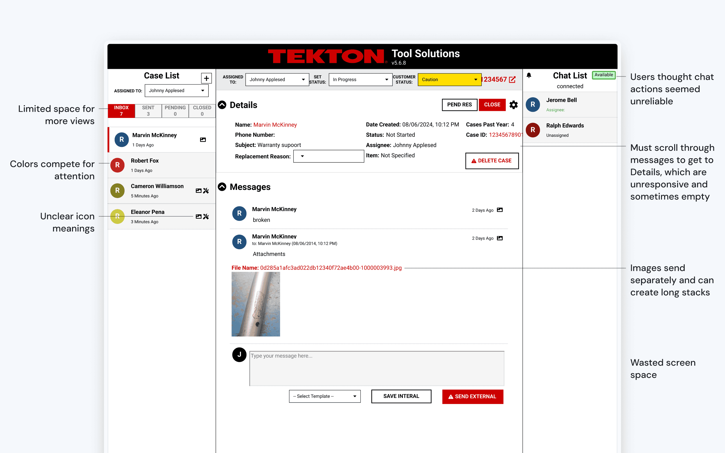
Vague or missing information slows down casework.
After learning more about the strengths and weaknesses of the platform, I was able to re-frame the design problem statement more accurately.
Based on this problem statement, I generated a list of requirements that could help address the problem. I refined it down to twenty-eight with the help of managers and support agents.
Getting the job done
Get details fast
We pinned details to the side by default. So when agents view a case, the main actions and crucial information are quickly available without needing to scroll through message history or open another tab.
Comfortable cancel cycle
We created a static buffer period. Now, support has a real opportunity to cancel every order as needed.
A reliable narrator
We decoupled the customer status from the case number metric to give the “caution” status its meaning back. We added a notes field for support agents to quickly give background on manually assigned “caution” or “fraud” customers and reduce others’ time spent investigating.
Work from anywhere
We kept all features included at every screen size this time around. So, support agents can resolve chats and cases on the go.
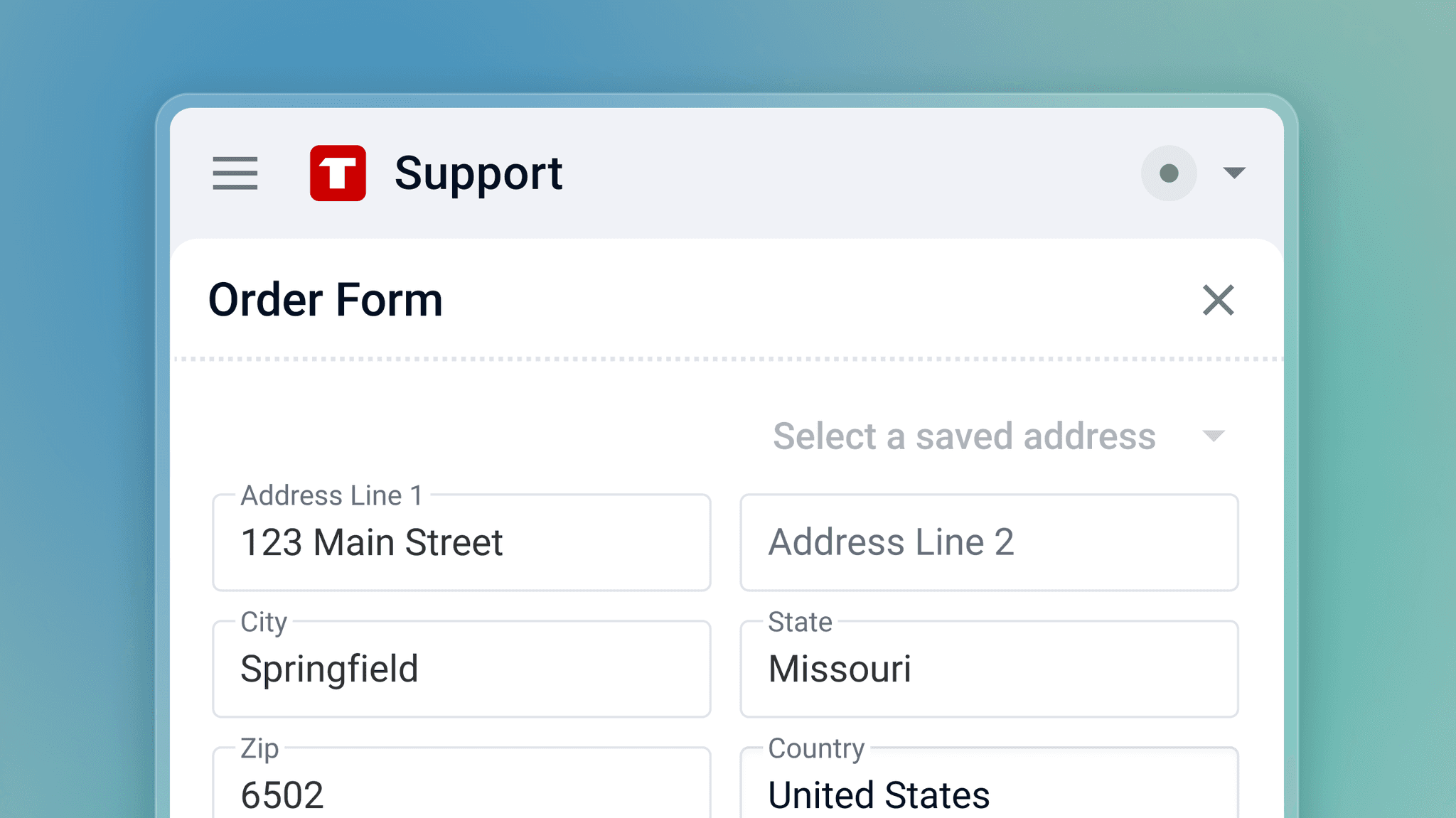
“Everything I need is within reach without cluttering my screen. I wouldn't mind working in it all day.”
How we got there
I kept three main pillars in mind while designing for the new site:
Data Overload: A primary challenge was incorporating large amounts of customer and case data while maintaining a clean and accessible UI that support agents could stand to look at all day.
Responsive Design: Ensuring the platform and information worked seamlessly on desktop, mobile, and everything in between.
Branding vs. Usability: I needed to tone down Tekton’s bold branding to prioritize readability and function in an information-dense environment.
I collaborated daily with support agents, developers, and leadership for iterative feedback. Often swinging by offices or setting up group meetings to compare ideas, walk through prototypes, and test solutions.
What's next
I delivered a fully revamped UI with features tailored to agent workflows, focusing on efficiency, collaboration, and data visibility.
Developers are now working on system architecture based on the final designs. We expect to user-test a working prototype within a month.
Expected impact
Streamlined workflows, reduced friction in managing cases, and improved fraud detection processes will enhance agent productivity and customer satisfaction.
Team
Olivia DeVries – Project Manager
Me — Design Lead
Olivia Prusinowski — Icon Design
Charles Kornoelje — Developer Lead
Lia Gelder — Developer
Duncan Van Keulen — Developer
Taylor DeJonge — Support Lead
Company
Tekton
Discipline
User research
User experience design
Interface design
